Dairy Queen Brand Refresh
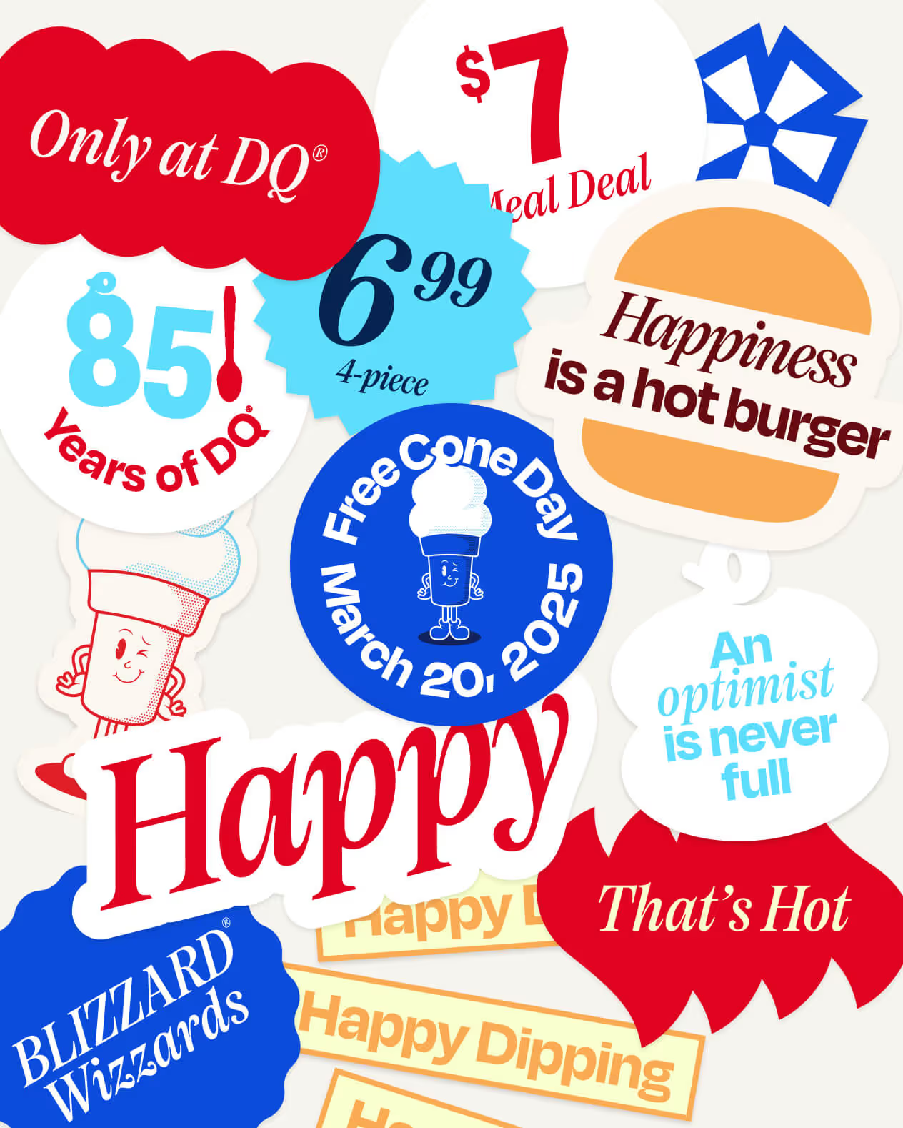
Happiness was never meant to be complicated
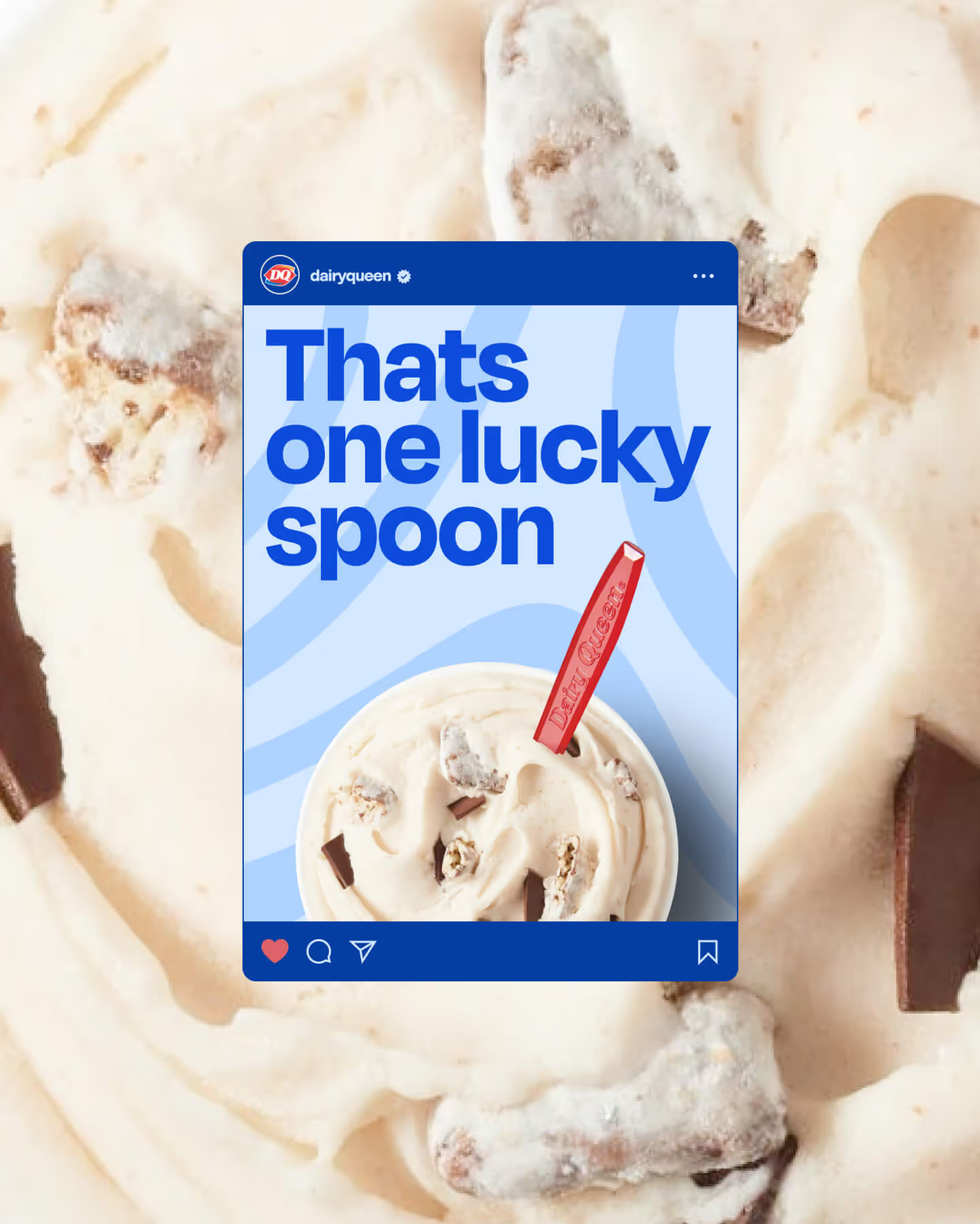
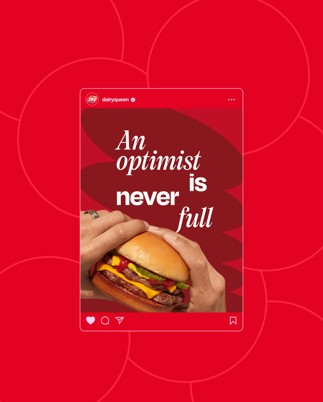
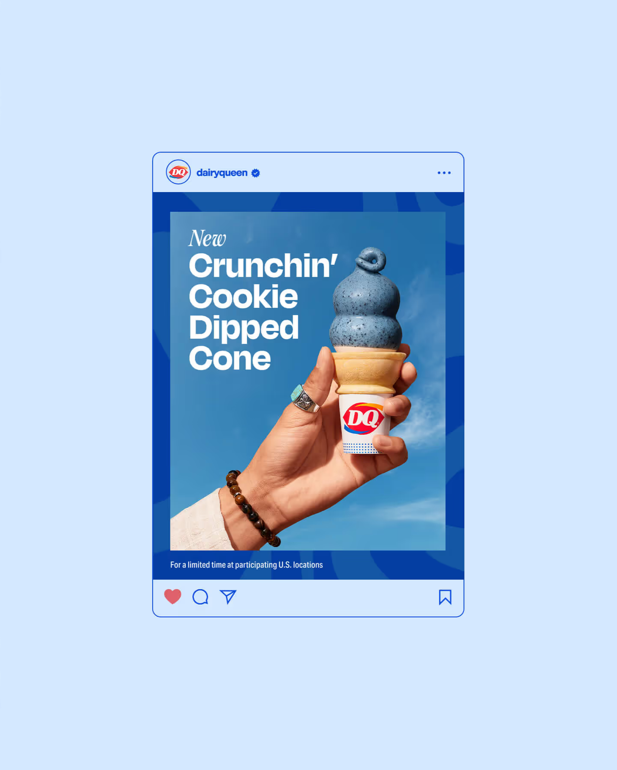
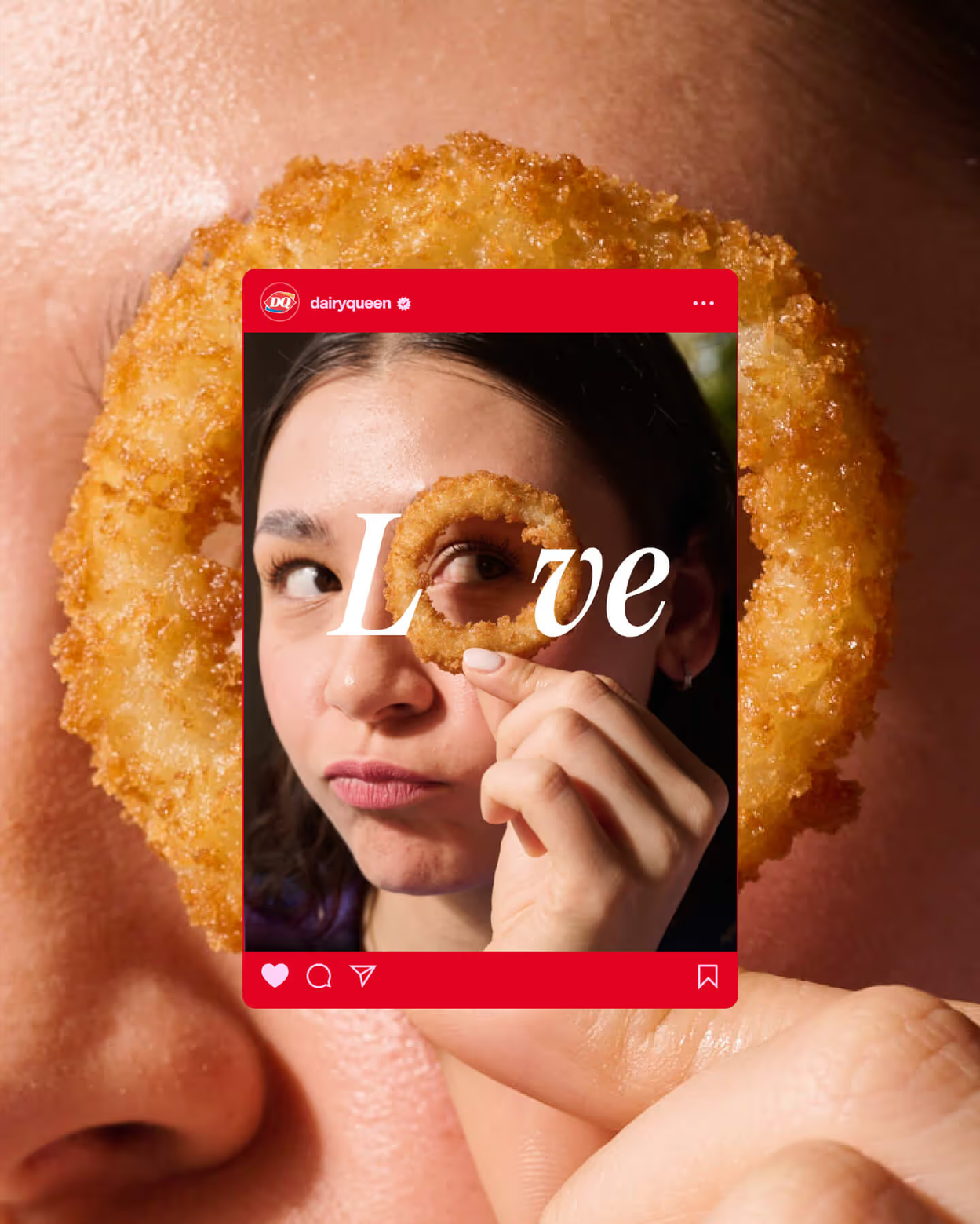
In a world that grows increasingly complex, DQ's new brand design system celebrates what makes the brand special: its delightful simplicity. The refreshed identity recognizes that life feels lighter when you're sharing a burger, fries, and a Blizzard Treat—moments when nothing seems too serious, overwhelming, or complicated.
At the heart of this evolution is "Uncomplicated Happy," an internal mantra that captures how DQ has always approached both business and customer experiences. This philosophy shaped every aspect of the brand refresh, from foundational strategy through tactical execution.
The redesigned verbal and visual identity ensures that every touchpoint—whether operational or customer-facing—delivers on DQ's promise to remain blissfully uncomplicated. The result is a cohesive system that reinforces the brand's authentic personality while creating more meaningful connections with fans.
My Role—
Senior Art Director & Associate Design Director
Results—
71% engagement rate
12% participation increase
1.5 Million social views
5.4 Million increase in revenue


Design System


Before

After

Iconic & Modern
The redesigned Blizzard logo strikes a careful balance between honoring its nostalgic heritage and embracing modern design sensibilities. By preserving the trademark elements that longtime fans cherish, the new design evokes fond memories for Dairy Queen's current customer base while creating an inviting entry point for new generations to discover the brand.
Moodboard (Hot/Food) vs (Cold/Treat) goes here
Graphic pattern & color

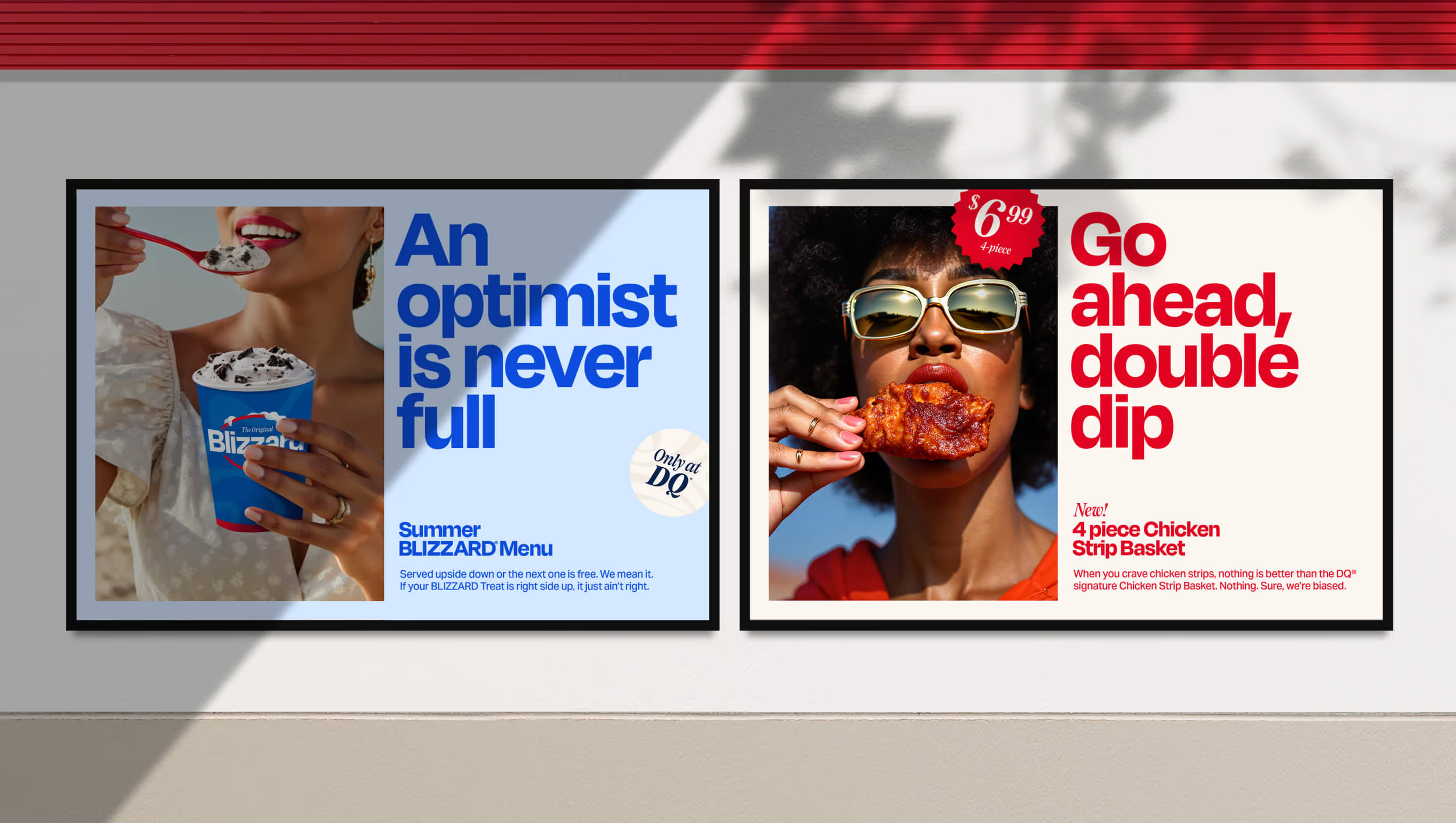
Pop & Social Guidelines (rules/grids)

POP & social moodboard or mockup